Sharks Water Polo
The Sharks are a Junior Olympics level youth water polo club based out of Redwood High School in Marin, California. Observing that their logo was not performing as well against the competition as does the team, I set about designing a refresh.
Scope
- Logo Refresh
- Merch Design
Logo System
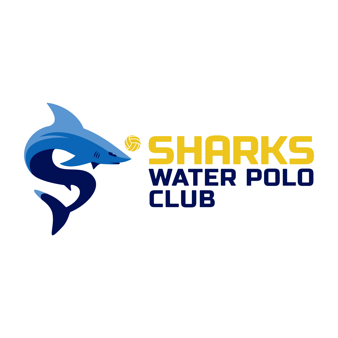
The Shark forms an “S” shape, evoking the “S” on Superman’s chest, and is interesting enough to stand on its own when needed. The iconic yellow water polo ball is included as if the shark is swimming with it, and as a color connection to the “Sharks” name. This helps Sharks and water polo be a quick read even from across the pool deck. Customized typography is bold and clear with the word Sharks proportionally large enough to be the first thing that catches the eye.



Team Spirit for Fans
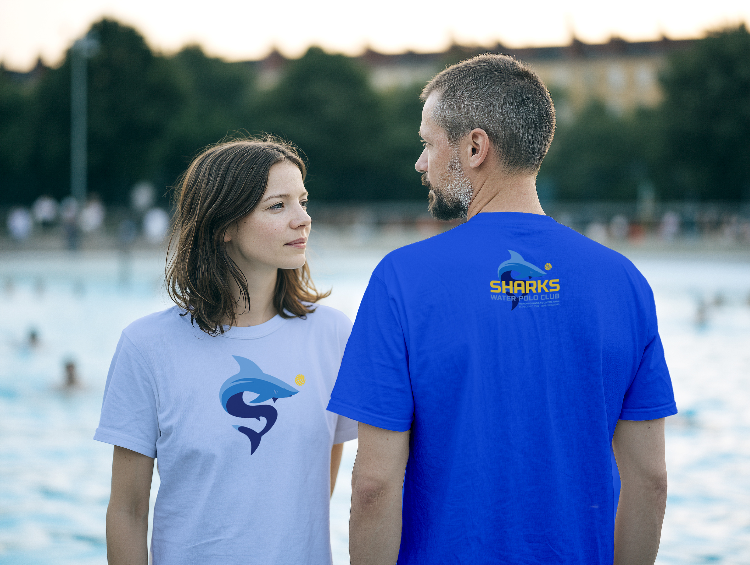
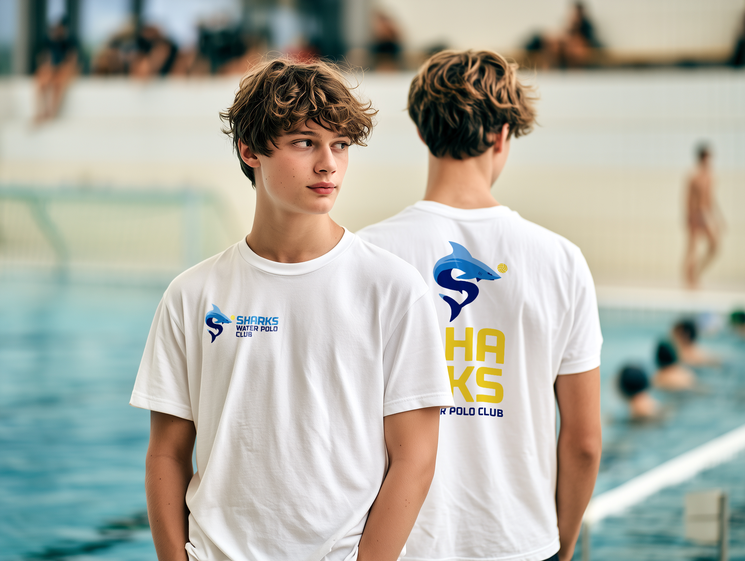
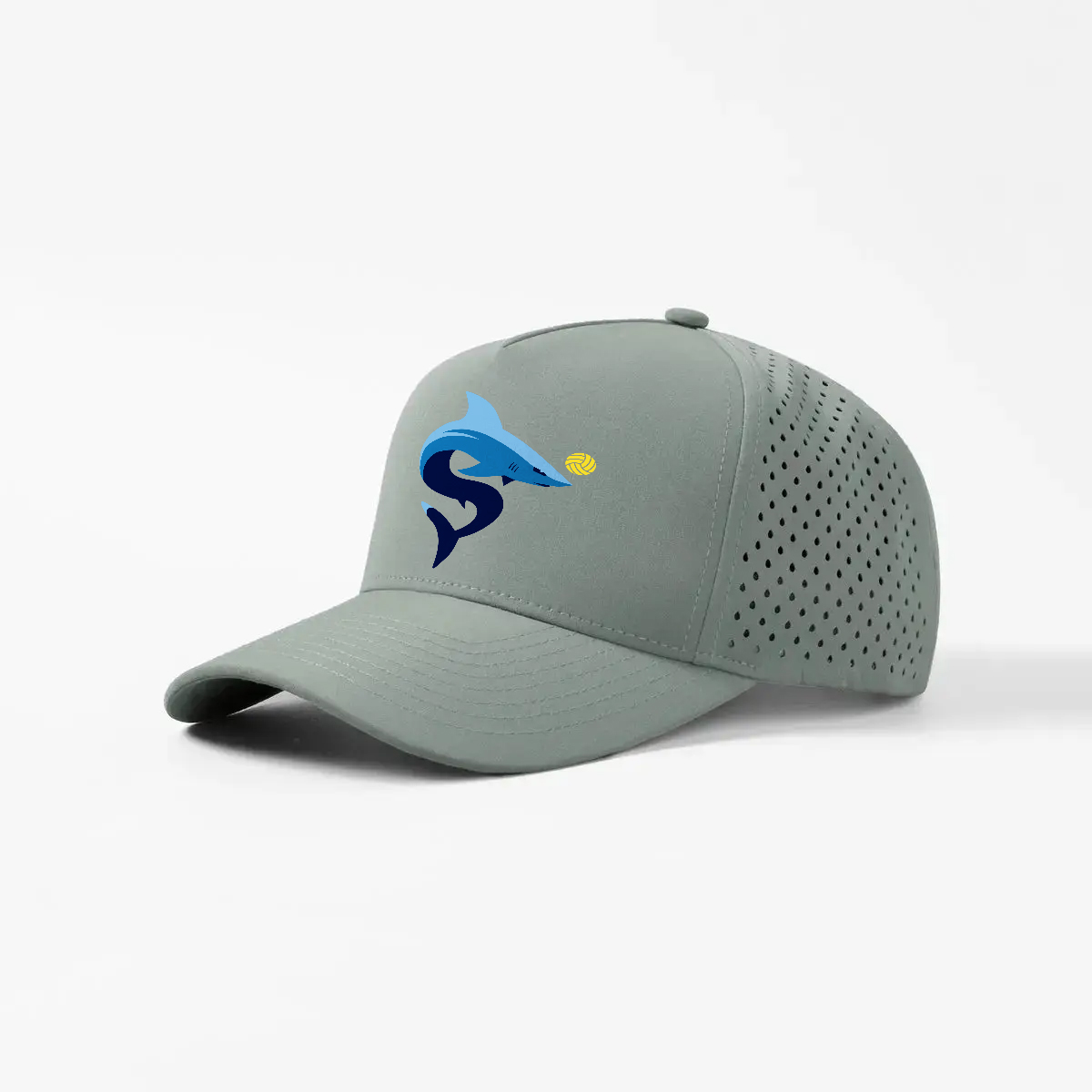
Players and parents love to support the team by flying the official colors. However, the Sharks had a limited selection of apparel and the original inspiration for the redesign came from overhearing parents wishing for more exciting options they could wear with pride at tournaments. I created a logo system that included several compositions as well as a range from full-color to single-color options. This makes it flexible enough for applications from hats and shirts, to stickers and banners.
Player Gear
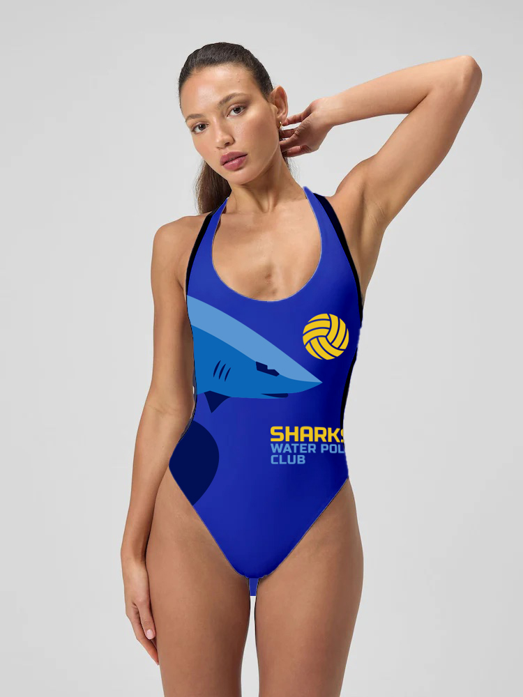
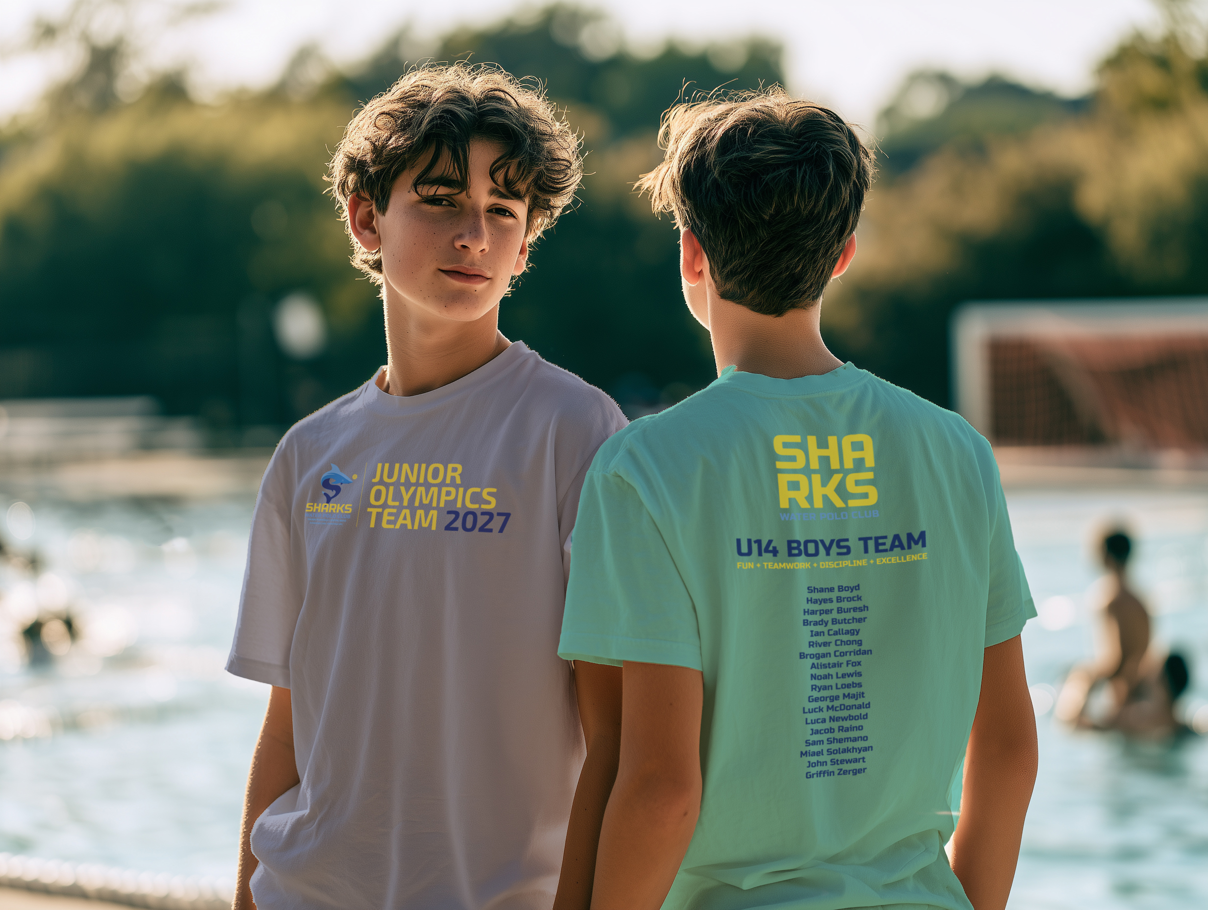
For the players I created preliminary competition suit applications and an example of the coveted Junior Olympics team shirt.