
Marinwood Waterdevils
Sometimes a logo is too beloved to replace but needs a facelift and personality update. Such was the case for the Marinwood Waterdevils swim team. I felt the existing version of the logo lacked the retro charm of the original and didn’t reflect either the athleticism of the swimmers or the sassy yet supportive attitude of the head coach.
Scope
- Logo Refresh
- Brand Book
- Merch Design
Logo System
I created a more dynamic and fluid posture for the waterdevil and included the trident as a primary element in pursuit of a respectful makeover.. Reshaping the trident allows it to represent both the “M” and “W” of the initials so it can be used as an optional stand alone graphic. The waterdevil itself separates the team name which has been rotated to accentuate the energy of the waterdevil as it breaks through the ring. The facial expression has been reduced to just goggle for eyes because team spirit and friendly competition are stronger traits of swim team culture than intimidation.
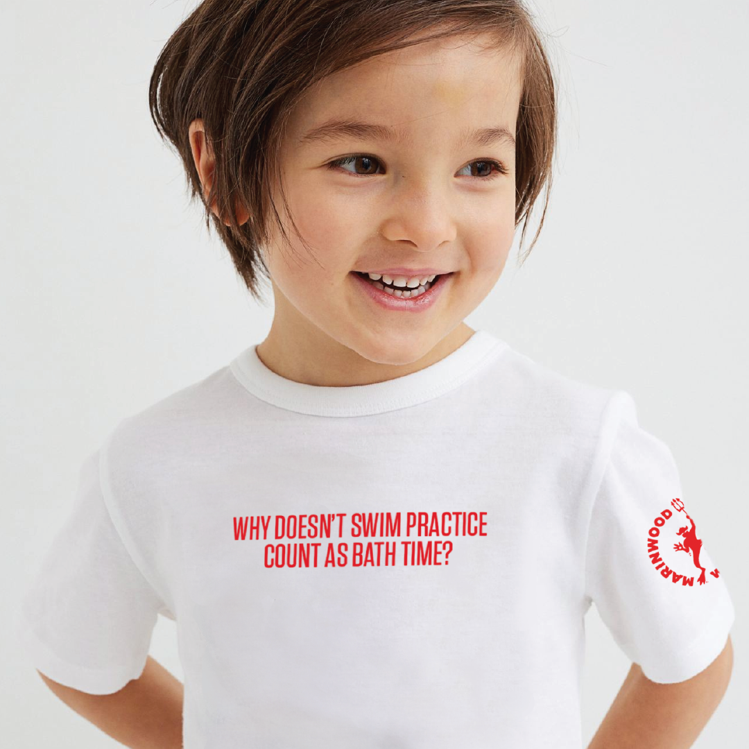
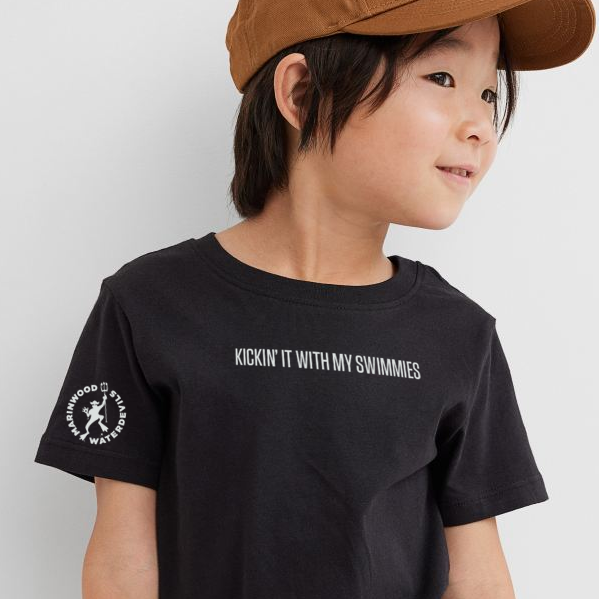
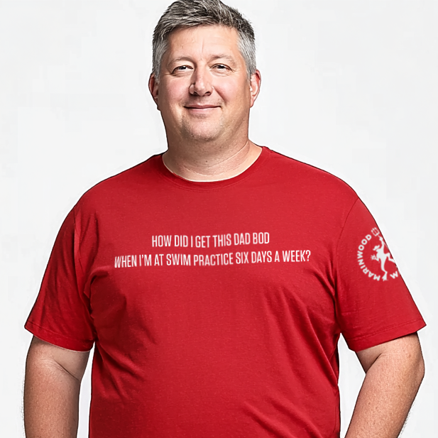
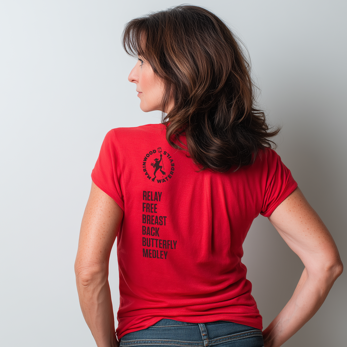
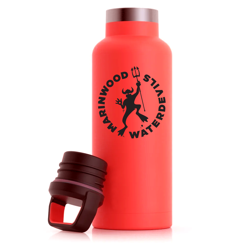
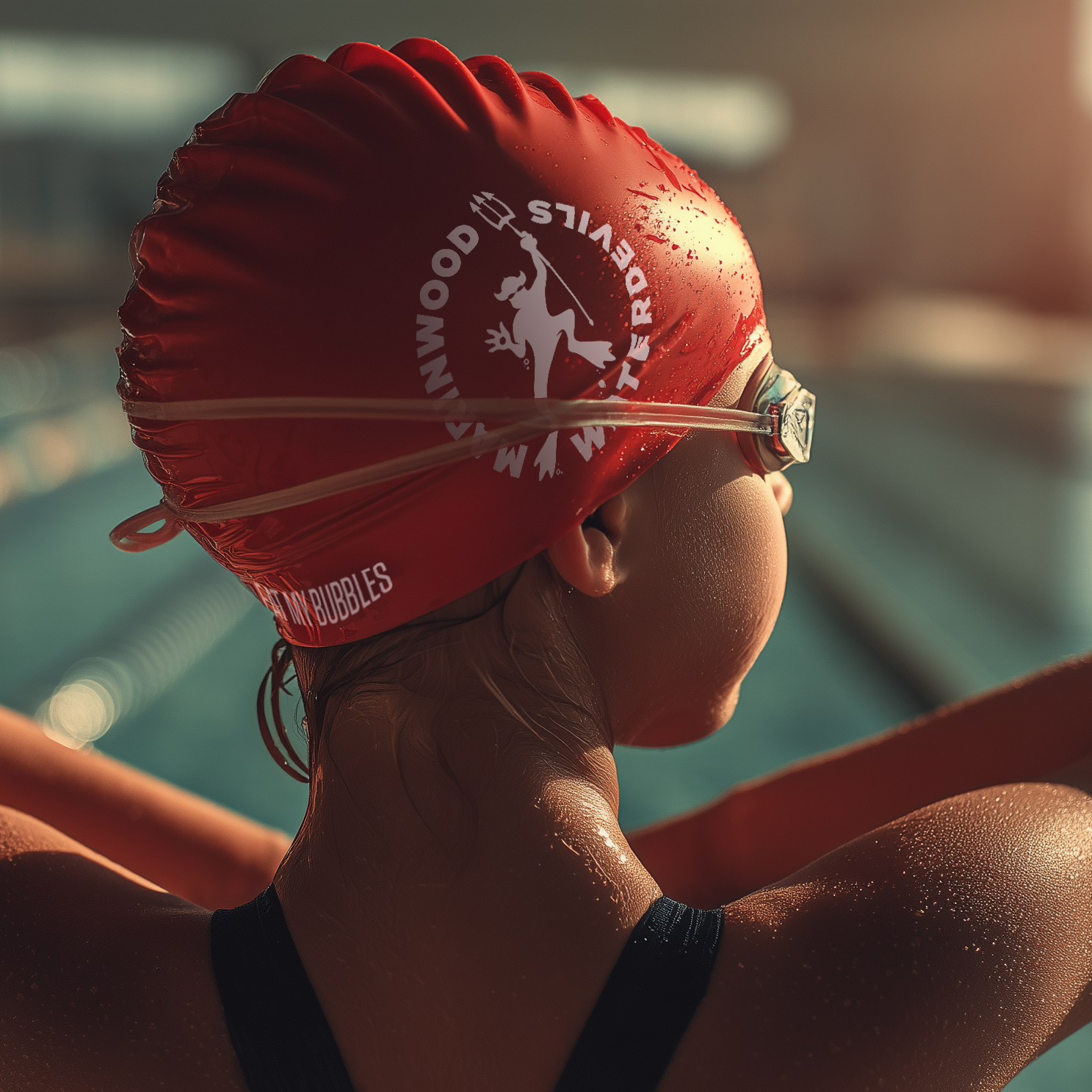
Merchandise
Merchandise is an important fundraising element for local swim teams so I also came up with a number of copy driven ideas for shirts, caps that drip with brand personality.
Brand Book
A brand book helps explain the grounding for the logo update and showcases the opportunity for consistent brand expression. It becomes particularly valuable as a reference when a governing board will be debating the update over time.