Clarifize
Clarifize is a business-focused networking app that builds networks based on a patented 3-way acceptance system. With a focus on network quality over quantity the results are stronger connections. These generate data and penetrating insight into relationships of influence within networks.
I worked with the founders of Clarifize to come up with the business name, brand logic and logo. Then went on to provide formative experience and visual design guidance that helped the original product idea evolve in exciting new directions.
Scope
- Naming
- Logo
- UX
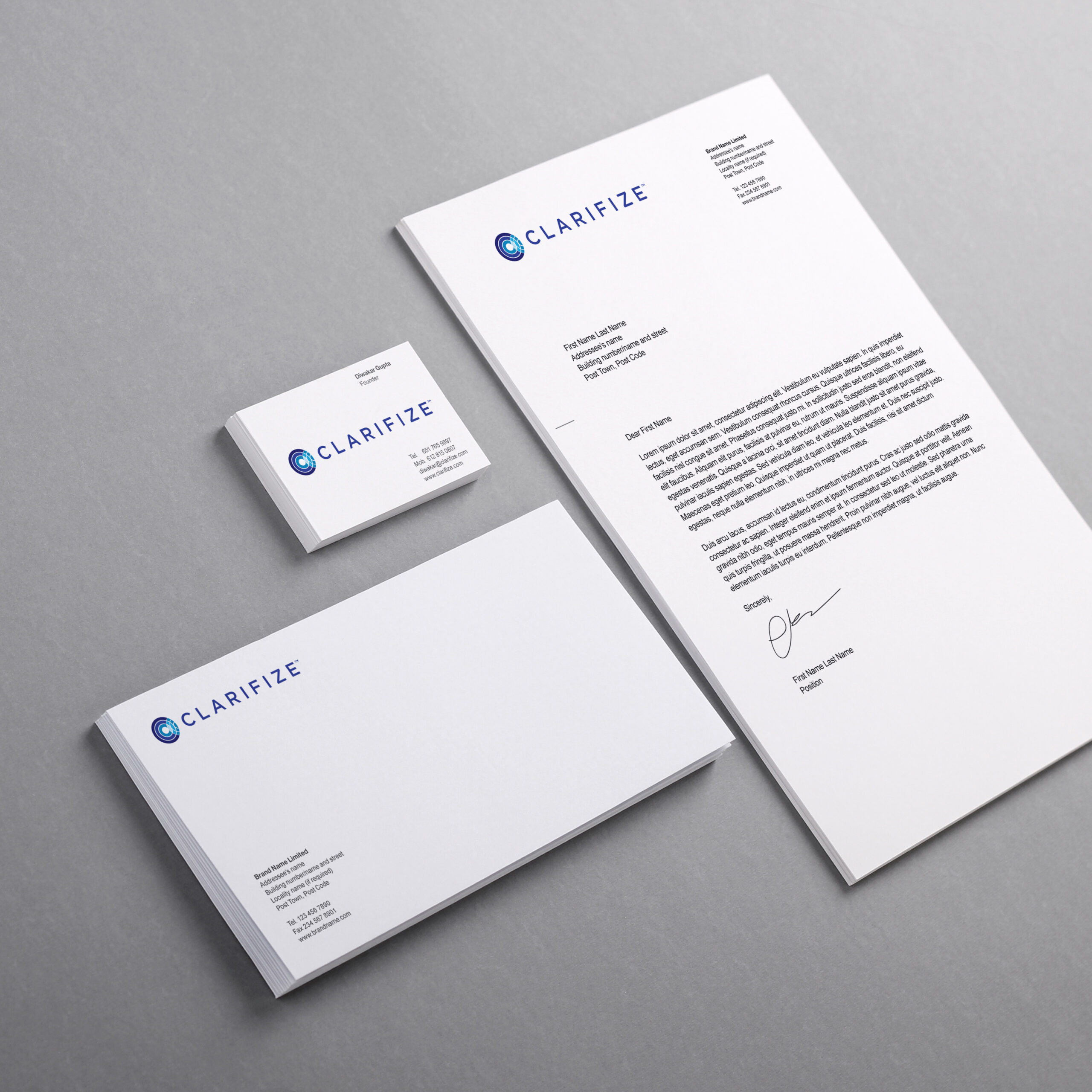
- Visual Design
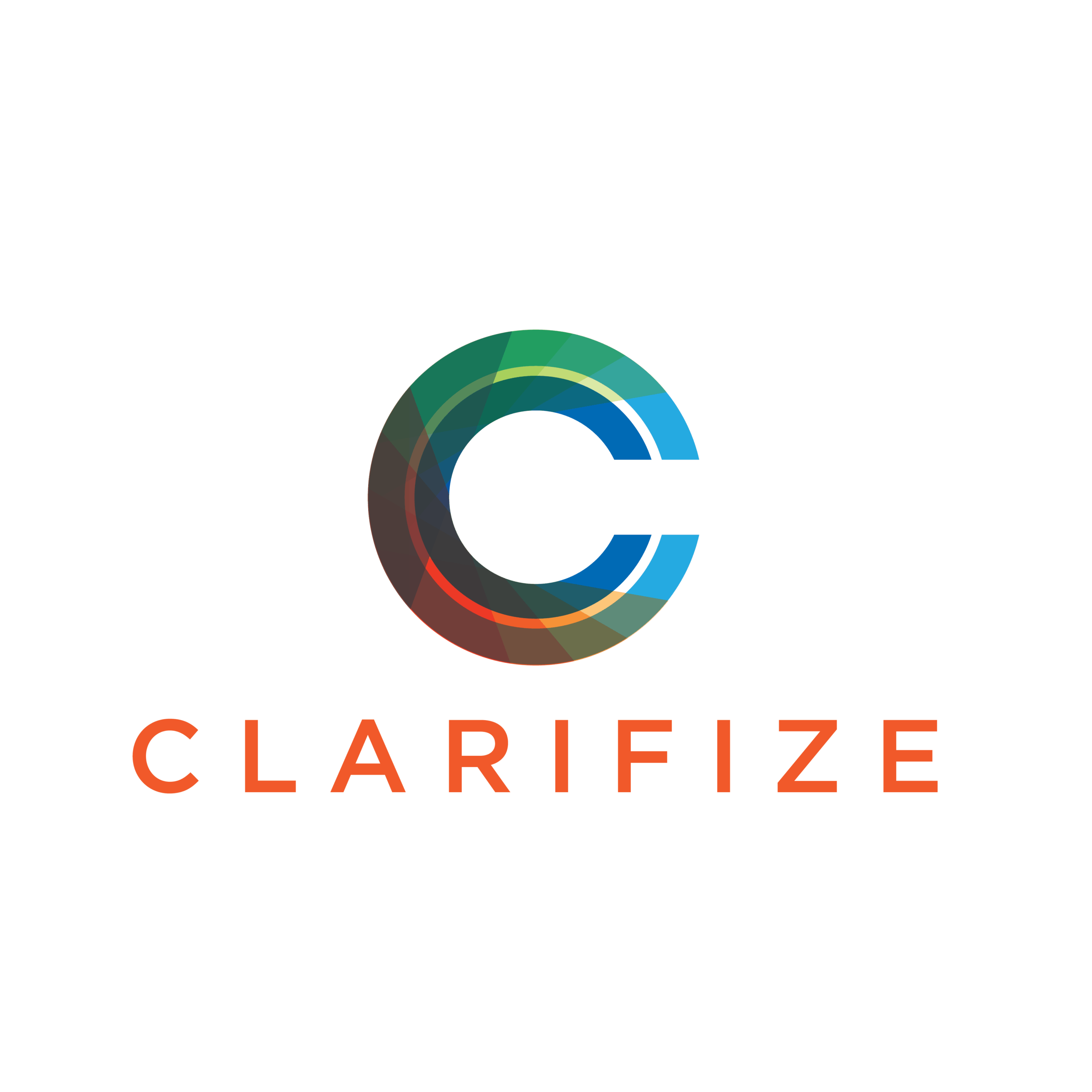
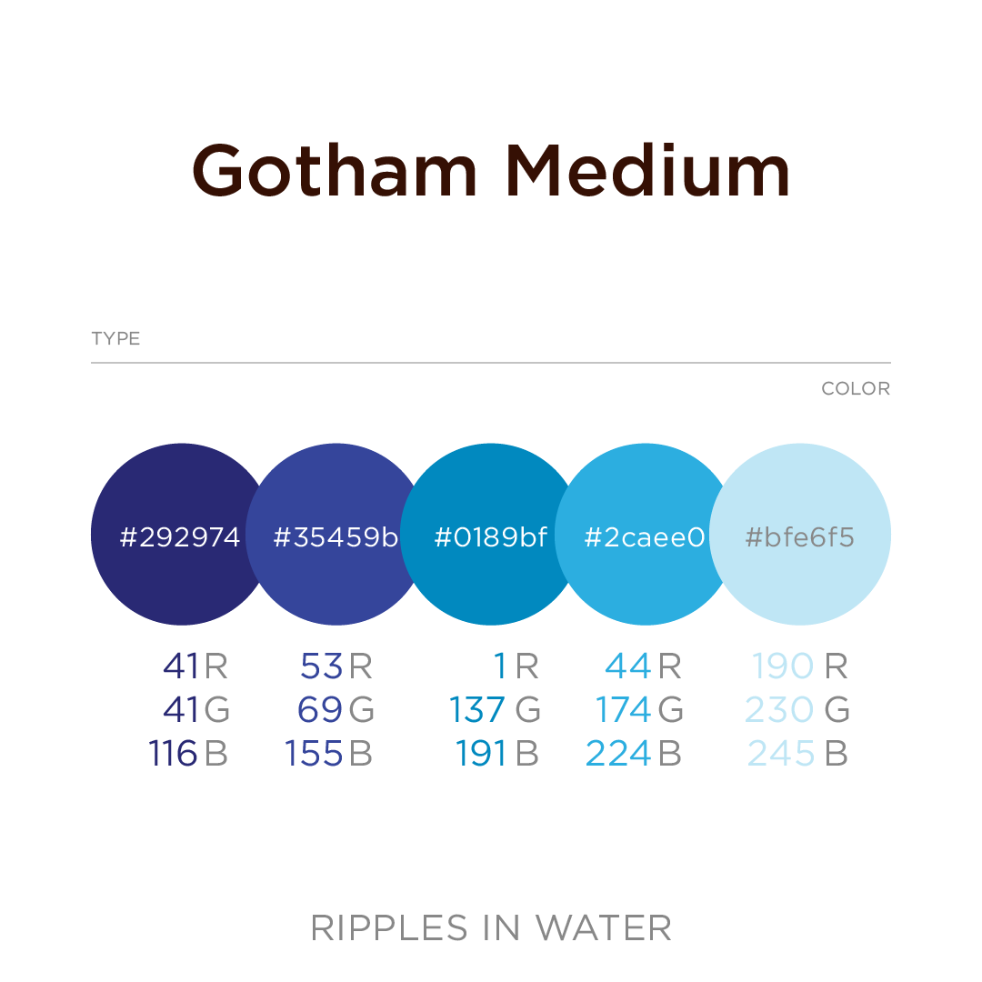
Logo System
Concentric circles represent spheres of influence that radiate outward from a compact core and intersect an adjacent network, creating the perceived “C” shape.
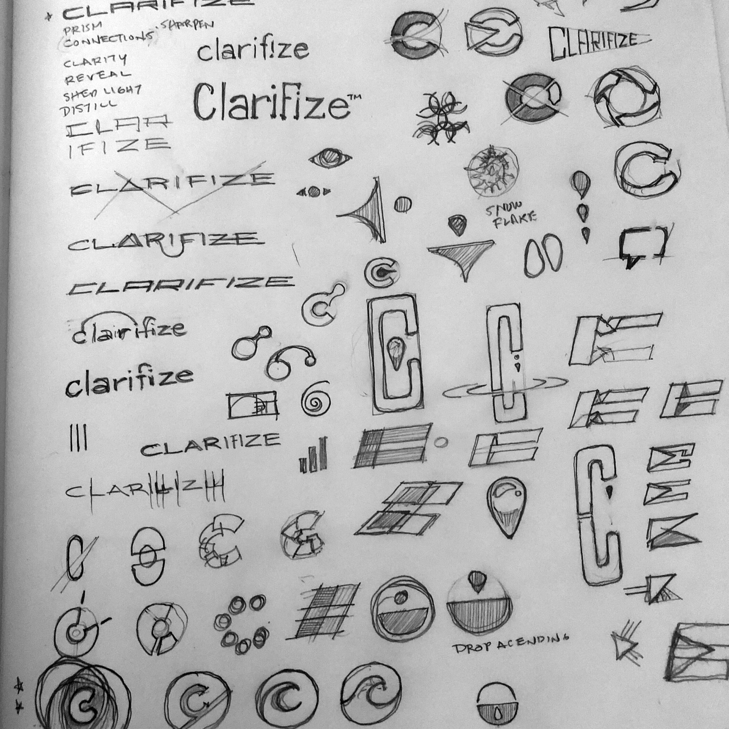
Logo Exploration
Start-up mode requires moving quickly through concept sketches, color exploration, and mock-ups to align a busy team. As a first step, I was able to help them transition away from the original sales focused name of SalesOpty. Workshops led to the selection of Clarifize. A name that would allow for more latitude for the business and product to evolve. I also moved through a wide range of logo ideas to tease out additional insight and inform a logo that provides flexibility to go wherever the business goes. This proved to be the right approach as the product direction shifted enough that it was given a new name and design. The Clarifize name and logo have been retained as the name for the parent corporation.