
Path As Place
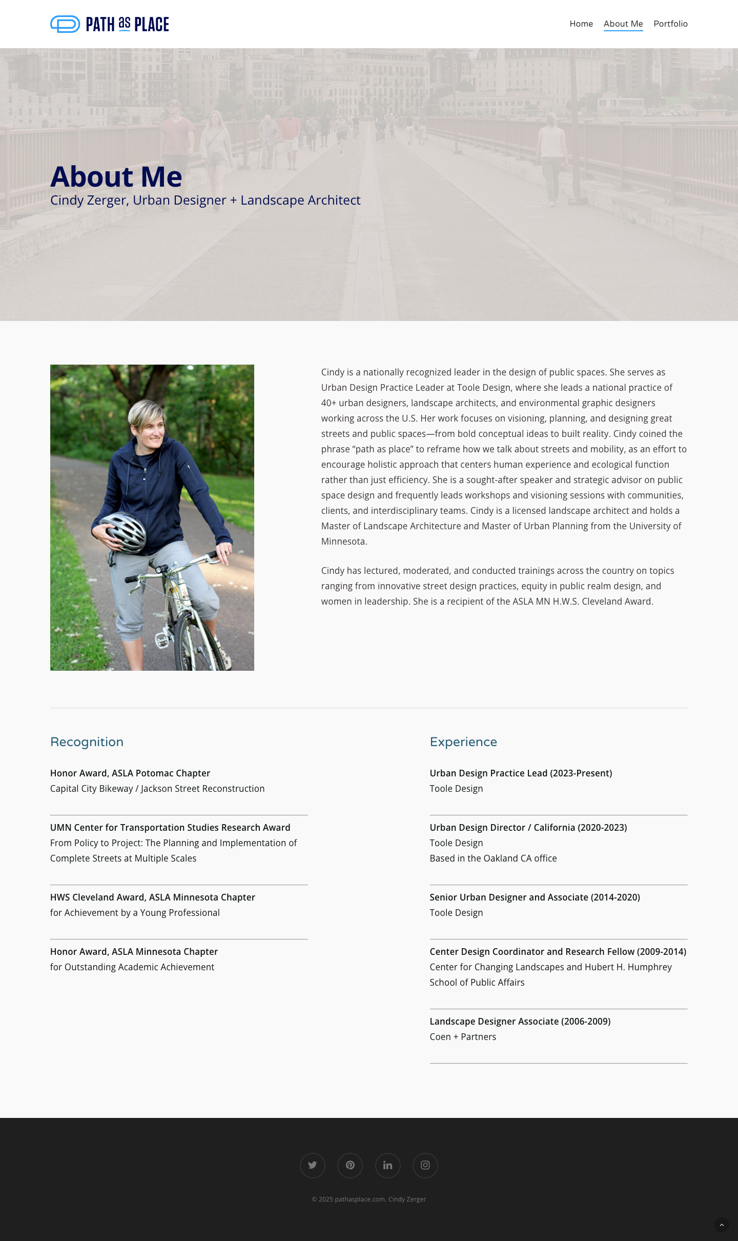
If you’re Cindy Zerger, you present your approach at national American Planning Association and American Society of Landscape Architects conferences, and lead teams to create impactful work in communities across the country.
Cindy had already created a memorable handle that was catching on. She wanted to own the phrase Path As Place as a rallying cry for her efforts to lead communities away from auto-centric design and to help attract inspired municipalities in need of help with their urban corridors, bikeways, and parkways.
Scope
- Logo
- Website
- Presentation Deck
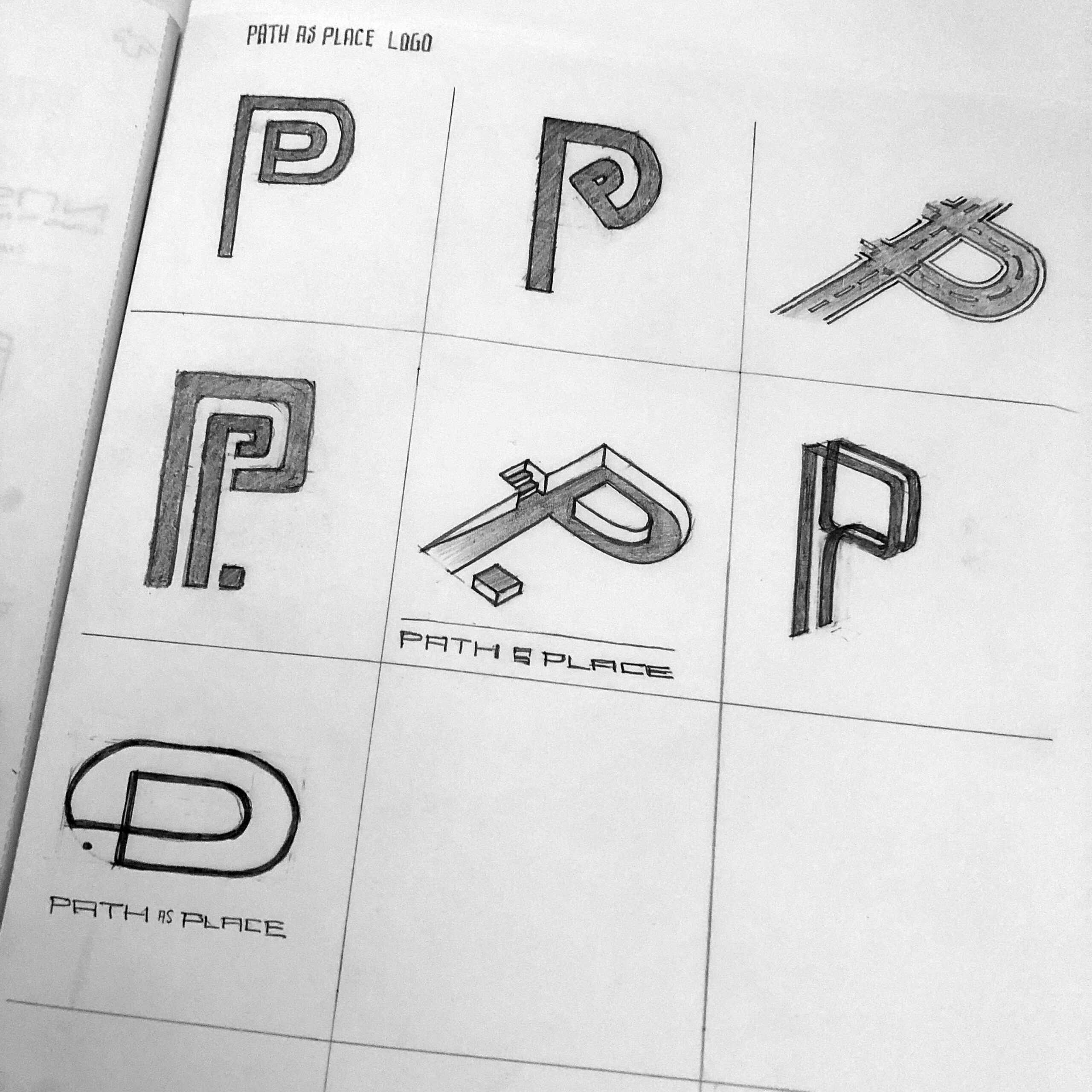
Logo Solution
Path as Place exists as a way to summarize and promote an approach to urban planning that is human-centric in both its design process and outcomes. The purpose of the brand is to share this vision and methodology to inspire the design of space between spaces.
The mark is a stylized letter “P” expressed as an element that adds interest to a looping path that is reminiscent of a path that folds in upon itself. This reinforces the idea that every location on the path is a place worthy of design consideration. There is always somewhere else to go to but one is not limited to being only in transit.


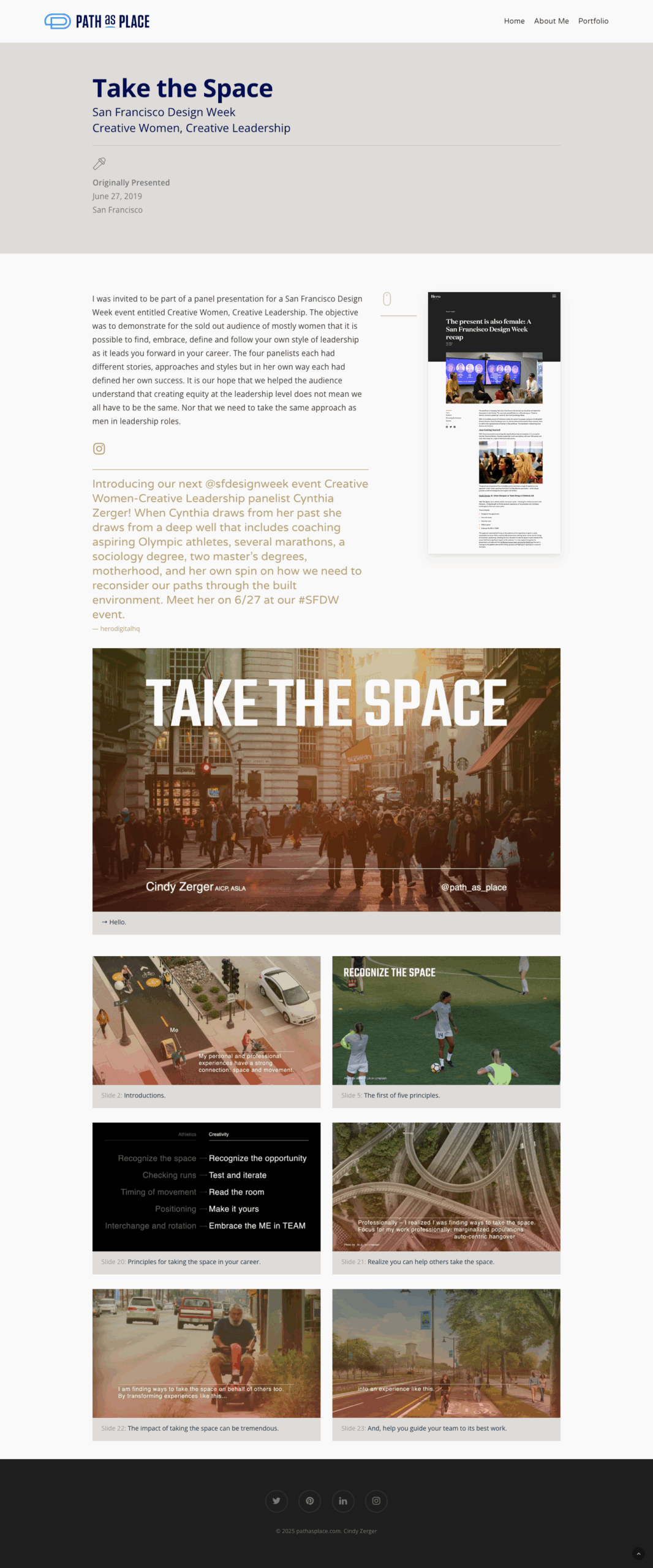
Presentation Decks
21st Century Street Design for the closing presentation at the national APA conference in NYC. Cindy drew attention to the irony that centuries of innovation and workarounds have led us to transit situations we would not have intentionally designed as a system. My experience with marketing industry pitch decks helped us keep slides simple and punchy so even those in the back of the conference hall received the full effect.


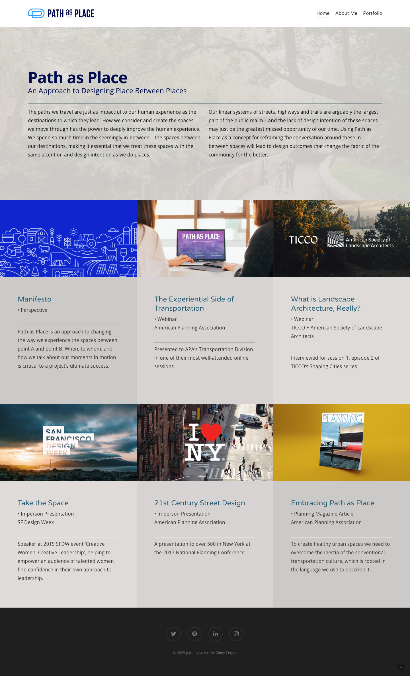
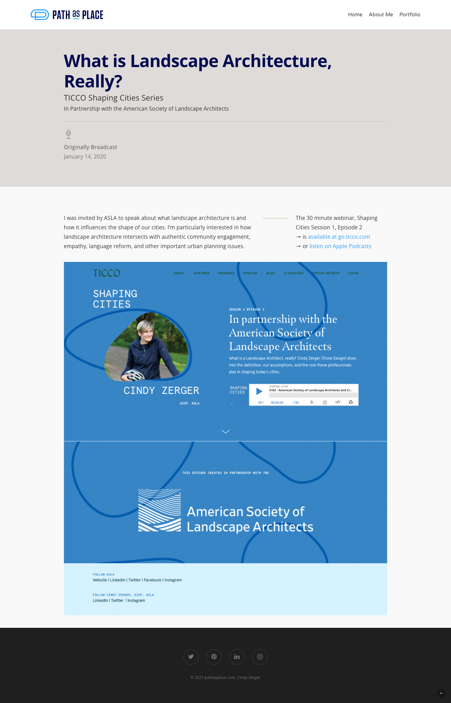
Website
Pathasplace.com is where Cindy can chronicle her ideas and impact, along with access to past presentations, publications and podcasts.
Success Story
Cindy has presented her ideas and approach at conferences in cities from San Francisco to New York City. She has attracted projects and helped impact municipalities in California, Minnesota, Colorado, Texas, Pennsylvania, Florida, to name a few. She has taught classes at the University of Minnesota, Twin Cities and University of California, Davis. Her Path as Place concept and dedication to it have helped her career as she brings to life human-scale spaces we can safely pass through or enjoy as we linger.
“The website is sooooooo cool to see live! I can’t wait to continue to add to it / refine it.”

Cindy Zerger
Urban Design Practice Lead