
Creed Interactive
Well, if you’re Jonathan Anderstrom, you start your own business and finish the job. Then you go on to turn this incredible sense of integrity, commitment and client partnership into a thriving interactive agency over the next 14 years.
I was working with Jonathan as he made this remarkable leap of faith and was honored that he chose me to create the original Creed brand, website, and marketing materials. I went on to work with him and the clients of Creed Interactive for over four years because his approach to deeply partnering spoke to the reasons I became a designer.
Scope
- Logo
- Business Card & Stationary
- Capabilities Deck
- Website
- Swag
Logo Development
Creed is a set of beliefs which guide someone’s actions, and connection is a belief that was integral to the inspiration driving Creed Interactive. So, it felt natural to use the letter forms as a way to visualize that connectivity.
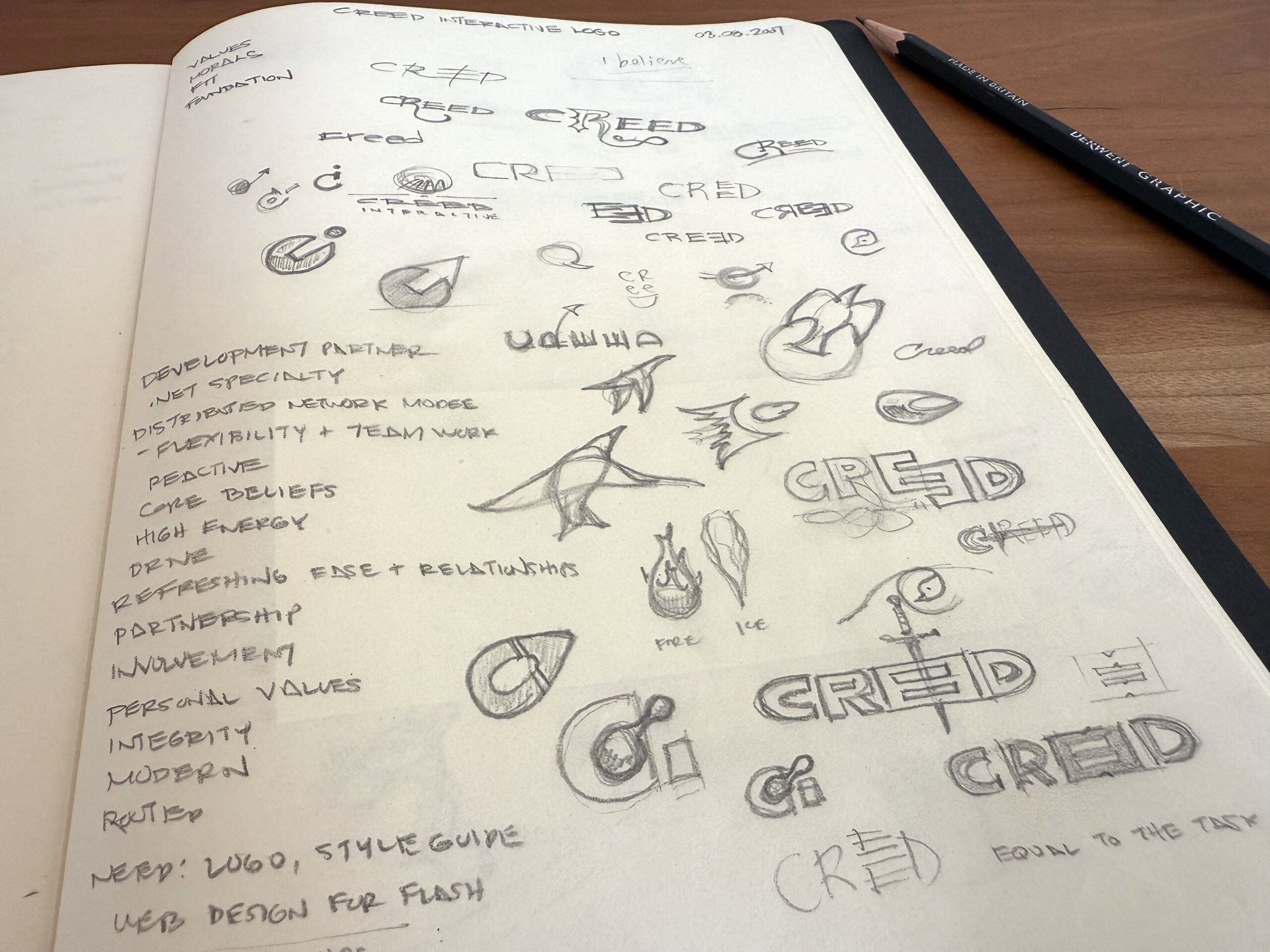
Exploration
A great deal of exploration goes on between conceptual sketching and the final stylized logo. Styling is often confused with design. While it is an important step it is exploration that distinguishes the design phase as a collaborative effort in which the business and brand truths are understood and used to create the logo’s character. Each concept in this phase should be strong enough to have its own name and distinct description.
C Wave Concept
The C shape is composed of four overlapping layers that evoke Creed’s ability to layer into another organization. The fan-like gray gives the overall shape the suggestion of motion or release of energy. The color and composition convey a crystalline precision and also signify the contributions by different disciplines to a unified whole.
Catalyst Concept
Using a type face with slightly beveled corners creates a crisp, modern look without appearing too sharp to touch. The circular elements represent the catalytic reaction (Creed plus Periscope for instance) generating results (appearing like bubbles or energy). I think they lend some personality but the logo can certainly run without them. Likewise I prefer color but the logo also reads well in black or white.
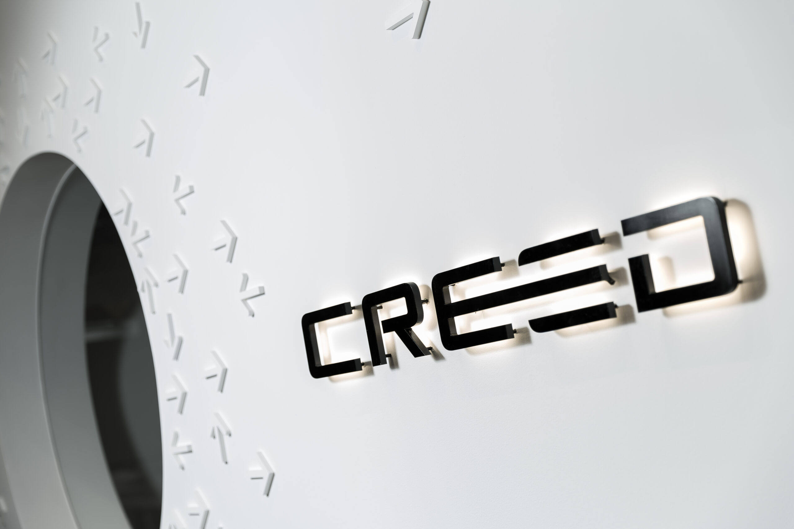
Signage
Co-founder, Stacy Anderstrom who led the interior design for the Creed offices incorporated the logo on warm, reclaimed wood in the entry, and warmly backlit in the reception area to subtly reinforce the comfort she and Jonathan intended to provide for clients and employees alike.


Success Story
Creed Interactive went on to design and build interactive experiences for businesses large and small. From Cooks of Crocus Hill to Slumberland Furniture, to Minnesota’s NHL team The Wild.
For Jonathan, becoming an entrepreneur was a childhood dream fulfilled and in 2022 sold Creed Interactive to successfully complete the startup cycle. Creed Interactive remains an active agency under new ownership and (sadly a new logo).
However, in what I consider the highest form of compliment, Jonathan reached out to me as he started his next startup venture, Creo AI.
“Todd is an amazing designer. He has the ability to firmly understand business goals and constraints and finds a way to surprise and delight his clients in a way they never would have thought.”

Jonathan Anderstrom
Founder Creed Interactive