Collaborative Leadership Center
Sugar Lake Lodge is a destination resort in Northern Minnesota. We felt the logo that had for years represented the family vacation and golf retreat business wasn’t setting the right tone for a new corporate retreat business.
Scope
- Logo
- Newsletter
- Banner Ads
Logo Development
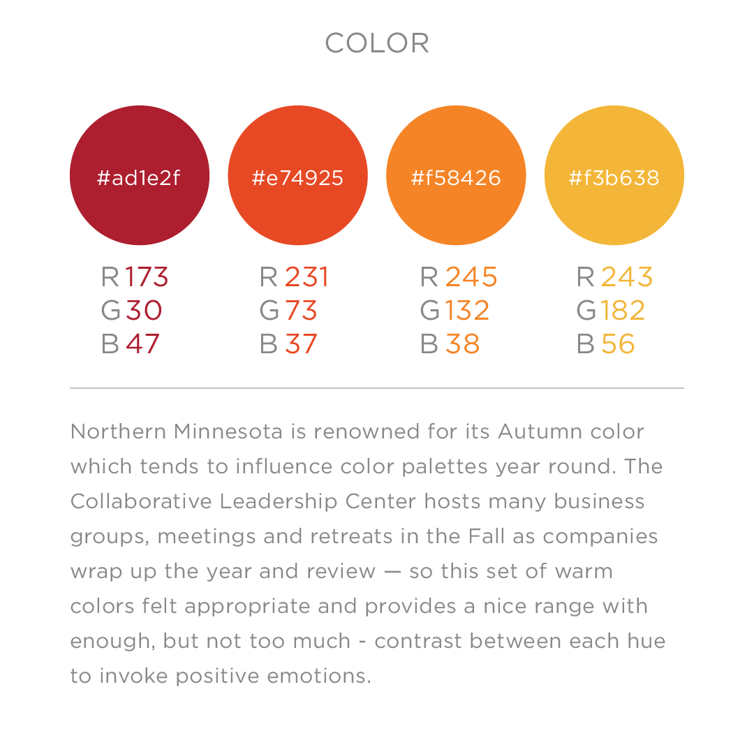
Northern Minnesota is famous for its fall color so I started with the premise that the new logo should work like a non-identical twin to the original. I worked to achieve a more modern, confident version of the maple leaf in the existing lodge logo. Warm colors also contrast the blue and brown of the familiar lodge logo — though I also explored the idea of a logo that would rotate through seasonal color palettes.
The horizontal format with the leaf emerging like a rising sun serves as a metaphor for business teams emerging with new found unity. It also works well with the CLC’s marketing strategy which includes paid media and a newsletter which might suit a horizontal format.


